
Workspace UX — search, navigation, tables
This page covers the Phase 1 UX features introduced 2026-05-12: spotlight search, mobile-friendly navigation, smart breadcrumbs, the unified DataTable component, and form save state.
Global search (Cmd+K)
Section titled “Global search (Cmd+K)”A single search box that looks across NCRs, CAPAs, Suppliers, RMAs, and Calibration tools at once.
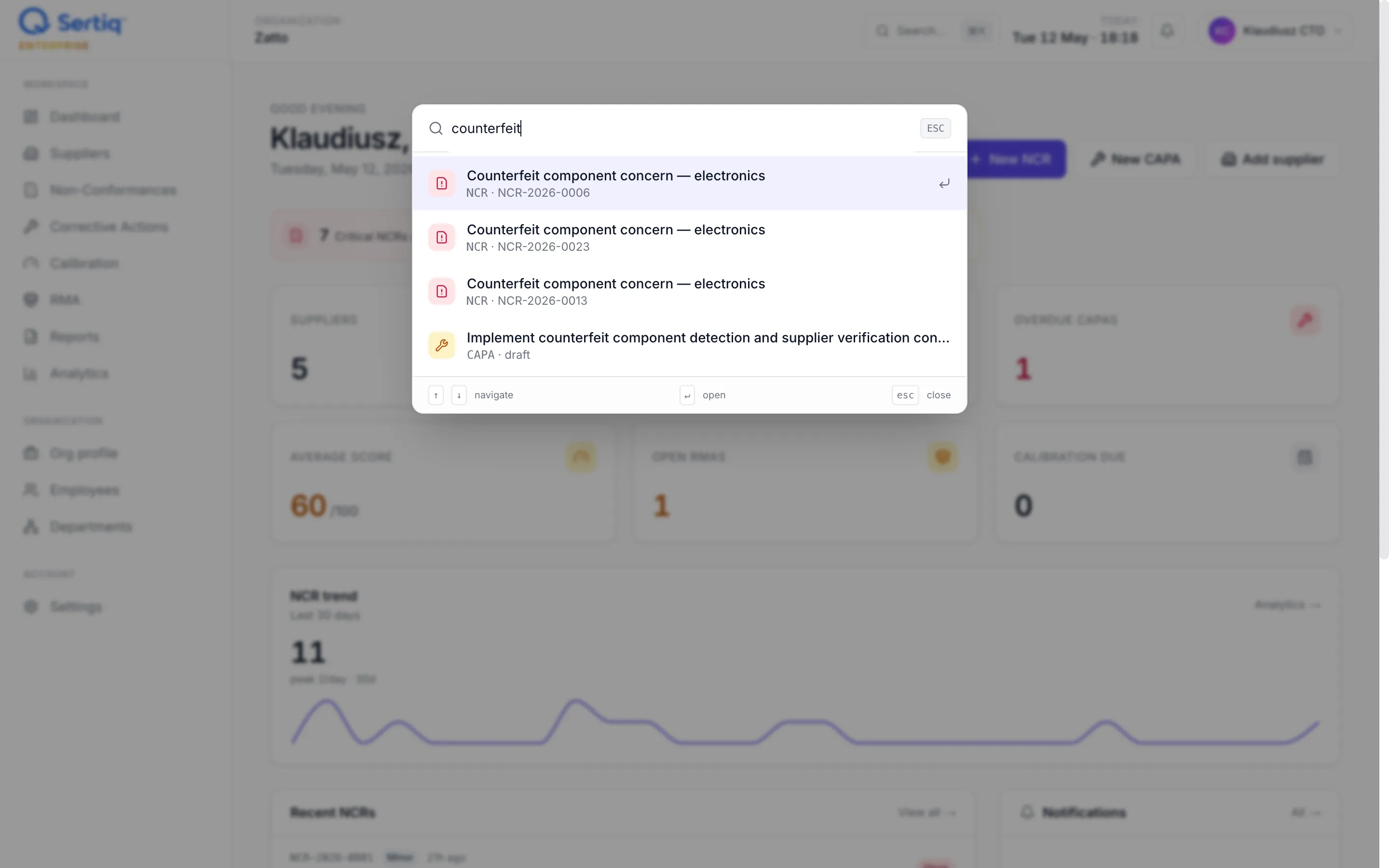
Opening it
Section titled “Opening it”| Shortcut | Where it works |
|---|---|
⌘K (Mac) | Anywhere in the app |
Ctrl+K (Windows / Linux) | Anywhere in the app |
/ | Anywhere in the app (when not in an input/textarea) |
| Search… button | Top bar, desktop only |
| Search icon | Top bar, mobile |
Using it
Section titled “Using it”- Type at least 2 characters. Results stream in below the input (180 ms debounce).
- Use
↑/↓to highlight a result,Enterto open. Escor click outside to close.
What it searches
Section titled “What it searches”| Entity | Matches on |
|---|---|
| NCR | title, ncr_number |
| CAPA | title |
| Supplier | name |
| RMA | rma_number |
| Calibration tool | name, asset_tag |
Each entity surfaces up to 5 results; the modal shows max 25 hits at a time. Results are scoped to your organization — RLS handles tenant isolation.
- A workflow shortcut: from the dashboard,
⌘K→ type a few chars of a supplier name →Enterto jump straight to their detail page. - Results show a coloured icon per entity type (FileWarning for NCR, Wrench for CAPA, Building for Supplier, PackageOpen for RMA, Gauge for Calibration) so you can scan quickly.
Mobile navigation
Section titled “Mobile navigation”The desktop left sidebar collapses on screens narrower than 768 px (Tailwind md). A hamburger icon appears in the top bar.
- Open: tap the hamburger (top-left). Drawer slides in from the left.
- Close: tap outside the drawer, or the × in the drawer header.
- Auto-close: the drawer closes automatically when you navigate to a new page.
- Active route is highlighted in the primary brand colour.
The drawer mirrors the desktop sidebar: Workspace, Organization, and Account sections.
Breadcrumbs
Section titled “Breadcrumbs”Breadcrumbs appear above the main content on list and settings pages. They show your location and let you click back up the hierarchy.
Where they show
Section titled “Where they show”- ✅
/settings/users→🏠 › Settings › Workspace access - ✅
/organization/employees→🏠 › Organization › Employees - ✅
/capa→🏠 › CAPA - ❌
/ncr/a1b2c3d4-…(detail page) — hidden, because the detail page already has a← Backlink in the page card. Breadcrumbs would be redundant. - ❌
/dashboard— hidden on top-level routes (would just sayHome).
Labels
Section titled “Labels”- Known segments use human labels:
ncr→ “NCR”,capa→ “CAPA”,issue-types→ “Issue types”. - Unknown segments get a title-cased fallback:
foo-bar→ “Foo Bar”. - UUID segments (rare; only when shown) are truncated to 8 characters and rendered in monospace.
Unified DataTable
Section titled “Unified DataTable”A reusable component used on the CAPA list — and the foundation for migrating other lists in future phases. It standardises the table experience across the app.
Features
Section titled “Features”- Sortable columns — click a header to sort; click again to reverse. The active sort is shown with an arrow indicator.
- Search box — debounced 180 ms; press
Enteror blur to commit.Escclears. - Faceted filters — dropdowns above the table (e.g. Status, Type, Overdue on CAPA).
- Pagination — 25 rows per page by default. Prev/next + “X of Y” counter at the bottom.
- Bulk selection — checkbox in each row + a master checkbox in the header. The header checkbox selects/deselects everything on the current page.
- Bulk actions — when you select 1+ rows, a blue bar appears at the top of the table:
N selected · Actions ▼. Click for the action menu. - URL-driven state — sort, filter, search, and page are all stored in the URL query string. Bookmarks and back/forward work. Shareable links work.
- Mobile-friendly — less-critical columns hide on small screens (configured per column).
CAPA bulk actions
Section titled “CAPA bulk actions”On /capa, after selecting rows, you can:
- Mark in progress — sets status to
inProgress - Mark pending verification — sets status to
pendingVerification - Close selected — sets status to
closedand stampsclosed_at(prompts for confirmation, since closing CAPAs is audit-relevant)
Each bulk action runs server-side, revalidates the page, and clears the selection on success.
Save indicators on settings forms
Section titled “Save indicators on settings forms”Most settings forms (Workspace access, Issue types, Sites) now show a “Saving…” spinner on the submit button while the action is in flight. No more wondering whether your click registered.
Backed by React’s useFormStatus hook — works with any <form action={serverAction}>. The button is disabled and aria-busy while pending, then re-enables when the server action completes or the redirect lands.
Forms currently wired:
/settings/users— Send invite, Change role, Remove/settings/issue-types— Add type, Save, Activate / Deactivate/settings/sites— Create site
Forms still on the basic submit pattern (e.g. CAPA / NCR detail) will be migrated in Phase 2.
Accessibility notes
Section titled “Accessibility notes”- All modals and drawers trap focus and close on
Esc. - Modal
role="dialog",aria-modal="true"with descriptivearia-label. - Breadcrumbs use
<nav aria-label="Breadcrumb">+<ol>. - Sort and pagination controls are real
<button>elements witharia-labelwhere the visual is icon-only. - Bulk-select checkboxes are real buttons with
aria-labelfor screen readers.
What’s next (Phase 2 preview)
Section titled “What’s next (Phase 2 preview)”- Apply DataTable to
/ncrand/supplierslists (keep their swim-lane grouping as an alternative view). - A11y deep audit: focus rings on all custom buttons, skip-to-content link, ARIA live regions for toast notifications.
- Loading skeleton states for slow lists.
- Virtualised rendering for 500+ row tables.