
Analytics dashboard
The Analytics page is a Pareto view of your non-conformance data. It surfaces the vital few drivers of supplier quality issues across three dimensions, so you can focus corrective action where it matters.
The 80/20 view
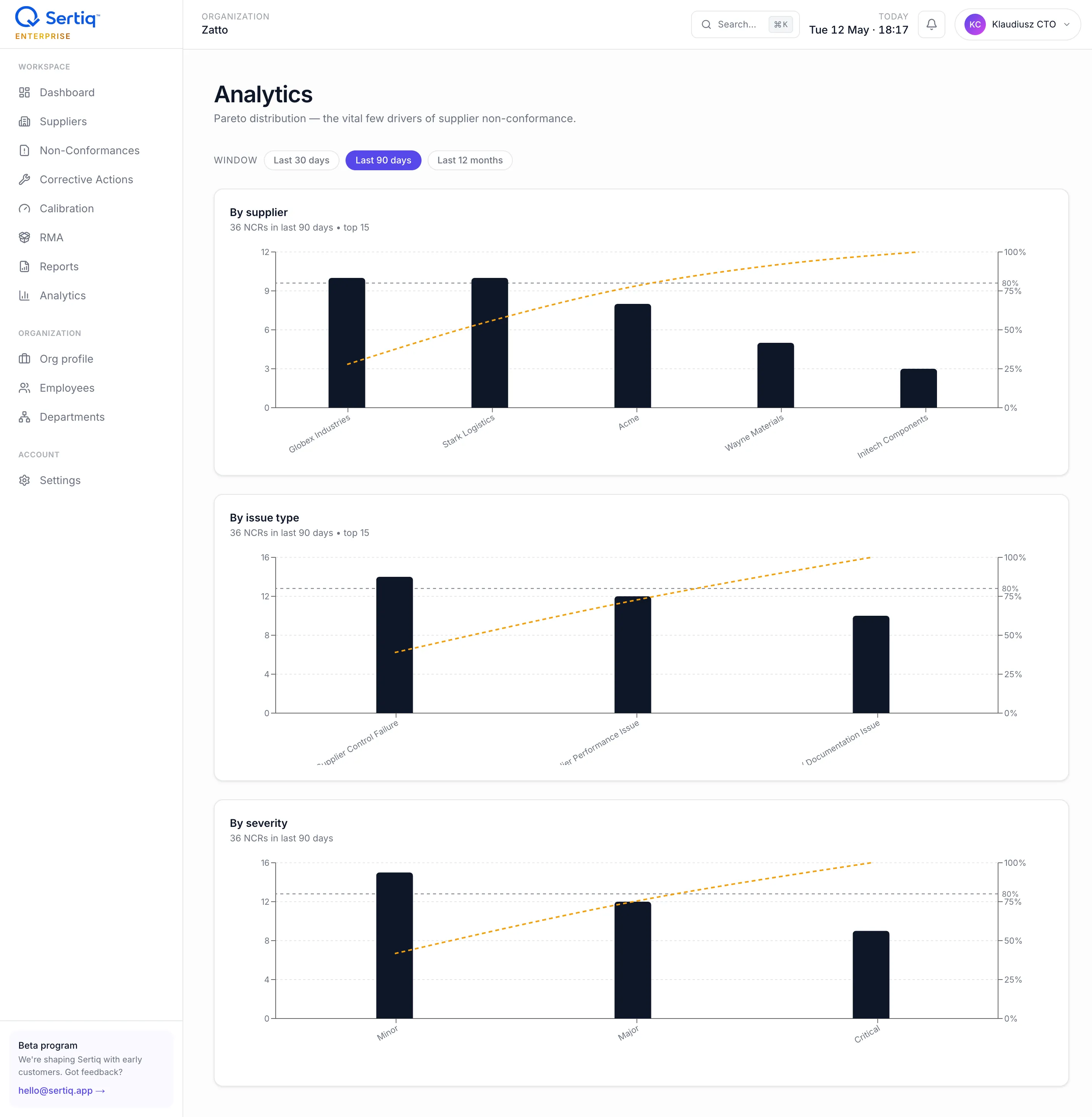
Section titled “The 80/20 view”Each chart shows count bars in descending order plus a cumulative percentage line. The conventional reading: where the line crosses 80% on the y-axis, the bars to the left are the “vital few” to attack first.
Three Pareto charts
Section titled “Three Pareto charts”By supplier
Section titled “By supplier”Which suppliers generate the most NCRs in the selected window? Top 15 by count, with the cumulative line.
- Use this to prioritise supplier development conversations, on-site visits, or de-listing decisions.
- Hover any bar to see exact count and percentage; click the supplier name to open their detail page.
- A supplier with one
criticalNCR may still be a smaller bar than one with fiveminorNCRs — this chart is count-weighted, not severity-weighted. Pair with the severity chart for the full picture.
By issue type
Section titled “By issue type”Which ISO 9001 8.4 categories dominate? Defaults to the three seeded types:
- Supplier Performance Issue (clause 8.4.1)
- Supplier Control Failure (clause 8.4.2)
- Supplier Communication / Documentation Issue (clause 8.4.3)
Custom issue types (see Issue types) appear too. Use this to spot whether your programme is dominated by a single failure mode (e.g. 70% communication failures = revisit your spec / PO process).
By severity
Section titled “By severity”Minor / Major / Critical split for the same window. A healthy distribution has the bulk in minor and a small critical tail; a top-heavy critical slice signals systemic risk.
Time window
Section titled “Time window”Switch between Last 30 days, Last 90 days, or Last 12 months from the window selector in the header. The count under each chart title updates accordingly. Window selection persists in the URL — bookmark or share the link to preserve the view.
Data scope
Section titled “Data scope”Only published NCRs count. Drafts are excluded (see Drafts & autosave). NCRs in disputed status still count — they are real findings until resolved.
NCRs with closed_at inside the window also count, regardless of when they were raised. The chart reflects “what we worked on during this window”, not strictly “what was raised”.
Drilling down
Section titled “Drilling down”Each bar is clickable. Clicking jumps to the filtered NCR list with the dimension pre-applied — e.g. clicking “Acme” in the supplier Pareto opens /ncr?supplier=acme&window=90d.
AI Pareto / Trend insights
Section titled “AI Pareto / Trend insights”On Starter+ plans, the AI Pareto Insights card (when enabled in Settings → AI) appends a narrative under the charts:
- Top issues with delta vs the previous window.
- Rising concerns — fast-growing categories even if small absolute.
- Suppliers at risk by NCR count and worst severity.
- CAPA health — open / overdue / effectiveness rate.
- One-line recommended focus for the week.
Costs 3 AI credits per regeneration; cached weekly per organisation in org_pareto_insights. See AI assist.
Export
Section titled “Export”There is currently no direct CSV export from the Analytics page. The audit .docx (Starter+) bundles the equivalent summary in narrative form — see Reports. For raw data, use CSV export from the NCR list (Pro+).
Edge cases
Section titled “Edge cases”Empty charts. A new organisation with zero published NCRs sees an empty state explaining what would appear once you raise records. Drafts don’t populate the chart.
Tail of long-tail suppliers. If you have 200 suppliers each with one NCR, the supplier Pareto looks flat — the 80/20 doesn’t kick in. That’s a real signal: your problem is breadth, not depth. Use the issue-type chart instead.
A single critical NCR dominates.
One critical NCR is still one count. Use severity chart and the supplier detail page to weight it correctly — Analytics is for trends, not single-event escalation.
Related
Section titled “Related”- NCRs — the source data.
- Issue types — categories shown on the Pareto.
- AI assist — AI Pareto narrative.
- Reports — audit
.docx.